Picture this: You’re starting your day. You’re prepping for your weekly team meeting, coffee in hand, and you open your laptop to find… chaos.
Sales numbers are in one Google Sheet, but half the rows are missing. Client feedback is buried in a Notion doc no one updated. Your marketing budget? Still saved in a file called “FINAL_final_USE_THIS_ONE_v3.xlsx.”
Sound familiar?
For many small and medium-sized businesses, this is the norm. Data is everywhere but nowhere at the same time. It’s scattered across tools, buried in inboxes, or saved in formats that require mental gymnastics just to make sense of. And when it’s time to make a decision – about a campaign, a budget, a new hire – you’re stuck piecing together fragments and crossing your fingers that it’s accurate.
But here’s the good news: It doesn’t have to be like this.
Organizing your data into structured tables, no matter which tool you use, is one of the simplest, most powerful upgrades you can make to your business operations. It transforms data from “something you have to clean up later” into a reliable decision-making engine. With the right structure, your information becomes clearer, your reporting gets faster, and your team starts working from the same page (literally and figuratively).
This isn’t just about spreadsheets. It’s about creating order from chaos, and building a data foundation that supports real growth.
We’re not here to sell you on Excel (or any specific tool). This is about something deeper: how organizing your data into structured tables can help your business make smarter, faster, and more confident decisions.
Why structured data matters
Think of your business like a kitchen. Raw ingredients (data) are everywhere. But unless you organize them – spices in jars, knives in drawers – you’ll waste time hunting instead of cooking.
Structured tables do the same for your data:
- They create consistency, so you’re not constantly cleaning up after every update.
- They reduce human error – formulas, summaries, and reports stay accurate.
- They’re scalable – meaning what works for 100 rows works for 10,000.
Example: Marketing Campaign Tracker
Imagine a marketing manager tracking campaigns. Without a table, they have notes in Slack, a Google Doc of results, and screenshots in a shared drive. Chaos.
With a simple table that includes columns like Campaign Name, Launch Date, Target Channel, Budget, and ROI, they can filter by platform, calculate average returns, and instantly report results.
What makes a table so powerful?
- Expandable structure
- Add new data, and the table adjusts automatically. No need to rewrite formulas or reformat charts.
- e.g., Add a new sales rep to your table, and their data is immediately included in team-wide totals.
- Built-in filters & sorting
- Find what you need – fast. Want to view only orders over $500? Just click and filter.
- e.g., An inventory manager filters out-of-stock items in seconds to reorder efficiently.
- Consistent formatting
- Clean, color-coded rows make trends and outliers jump off the page.
- e.g., Conditional formatting can highlight overdue invoices in red – no detective work required.
- Named columns, not cell references
- Say goodbye to cryptic formulas like “=B2*C2”. Instead, use “=Price*Quantity” – easier to understand, maintain, and scale.
- Live updates in charts
- Build visual dashboards that reflect the latest data automatically. Perfect for weekly meetings or executive overviews.
Best practices to make your tables work harder
Creating tables isn’t just about slapping data into rows and columns. A little structure goes a long way. Here’s how to make your tables efficient, professional, and reliable.
This guide is here to help you level up your spreadsheet game. Whether you’re tracking leads, organizing sales data, or just trying to stop Excel from yelling at you, these practical tips will help turn chaos into clarity.
We’ll work on a spreadsheet, improving it step by step.
Let’s bring this to life with a story.
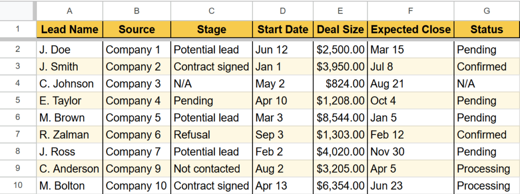
Meet Mia, the Sales Manager
Mia oversees a five-person sales team. She’s responsible for tracking new leads, deal size, close rates, and monthly revenue. Until recently, her “system” looked like this:
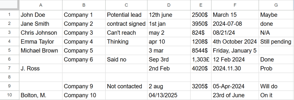
- Leads in someone’s inbox
- Revenue in an outdated Excel file
- Notes in a team chat
- And no visibility into the performance
Let’s fix Mia’s spreadsheet step by step together.
1. Use clear column headers
Why it matters: Headers are your data’s compass. Without them, it’s easy to get lost. Especially when handling complex data, it’s best not to rely on the fact that everyone will interpret your data in the same way. Clear, straightforward naming of each of your columns should prevent any confusion.
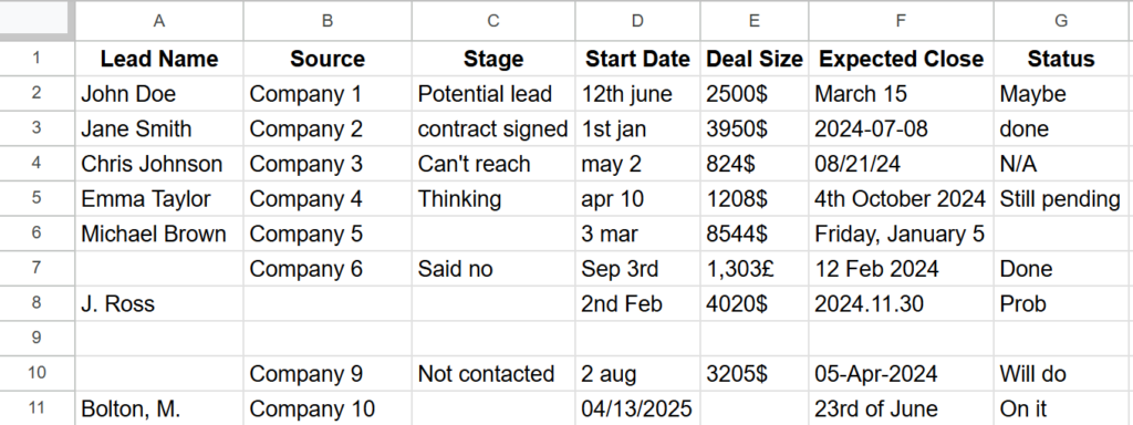
Pro tip: Use title case and avoid abbreviations unless you explain them somewhere.
2. Avoid blank rows or columns
Why it matters: Empty space can break formulas, confuse sorting tools, and throw off analytics dashboards. It’s always a good idea to make sure you don’t have any blanks in your data set in order to avoid problems further down the line. This would be a good time to centralize all the data you have from various sources into one place.
Tip: Use row shading or grouping if you need visual separation.
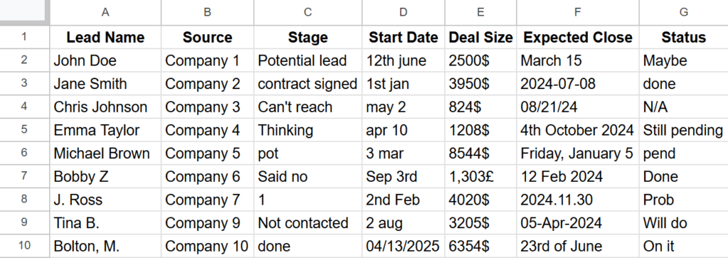
3. Stick to one data type per column
Each column should contain the same kind of data – all numbers, all dates, or all text. Mixing these causes formulas and charts to misfire. If you want to make sure that all your formulas work as intended and you don’t end up with errors that are confusing to troubleshoot, make sure that you take your time at this stage. Clearly formatted data can save you a lot of headaches.
e.g.: Don’t combine “March 2024” and “3/15/24” and “This month” in the same column.
4. Name your tables or sheets
Don’t leave your data hiding in “Sheet1” or “Table3.” Give them descriptive names that make referencing a breeze. Always make sure that your sheets and tables have a name that references their content and can be easily identified at a glance, so that the team members who require those sheets can easily find them.
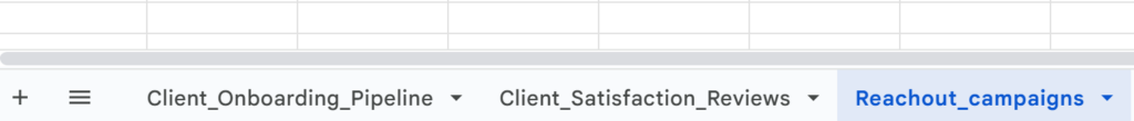
e.g. Client_Onboarding_Pipeline, Q2_Sales_Targets, or 2025_Event_Attendance
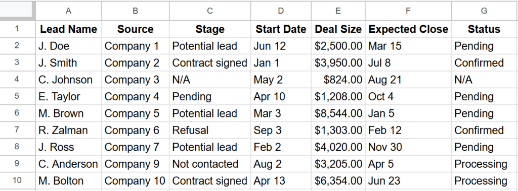
5. Use formatting to enhance, not distract
Design matters. Use clean fonts, bold headers, alternating row colors, and data-aligned formatting (like currency, dates, %). Despite the fact that most companies now rely on AI-powered tools to deal with data management and processing, some questions can be answered by a simple look if your data is clearly and consistently formatted, as well as reducing eyestrain.
Pro tip: Freeze the header row so you can always see what you’re working with.
The Fix: One central sales table
Mia now has a structured table with all the information she needs in one place, easy to use either in formulas or sheets. Her spreadsheet can help answer questions accurately and quickly, just by using some simple filters or formulas:
Now she can:
- Filter to see deals in the “Potential lead” stage
- Sort by close date to forecast next month’s revenue
- Use formulas to calculate the average deal size
- Link this data to a dashboard for leadership reviews
Her team is now aligned, and Mia spends less time tracking things down and more time closing deals.
Tables + tools = magic
Once your data is clean and structured in a table, you’re no longer stuck doing everything manually.
That’s when tools, automations, and AI features can step in – and actually work as promised. Without a strong foundation, even the smartest AI assistant will get tripped up by messy columns, mixed data types, or missing headers.
But when your tables are well-built? That’s when the real magic happens.
You can go from:
“Wait, where did that number come from?”
To:
“Here’s the updated forecast; it auto-refreshes every day.”
From:
“I’ll manually copy this data into our dashboard later…”
To:
“It updates itself the moment a deal is closed.”
In short, good tables unlock smarter tools. And when you combine the two, you get faster workflows, clearer insights, and way fewer headaches.
Tools that make life easier:
- Copilot in Excel/Google Sheets: Suggests formulas and even builds tables with a prompt.
- Zapier/Airtable Automations: Auto-update a record when a form is filled out.
- AI dashboards (like Metabase or Apache Superset): Connect your table and turn it into live insights.
e.g.: Connect your customer support table to a dashboard that shows ticket resolution times in real time.
Bottom line: Tables aren’t optional – they’re essential
Inconsistent, scattered data = missed insights, slow decisions, and costly mistakes. But with a clean, structured table, you get:
- Instant clarity
- Accurate insights
- Streamlined workflows
- Less stress
So next time you’re juggling data, ask yourself:
“Could this be a table?”
If the answer is yes, that’s your cue to bring order to the chaos.
About the Author
George writes about content strategy, digital learning, and the workflows that make information actually useful. With experience across editorial and edtech, he’s all about turning scattered content into clear, well-oiled systems that save time and make sense.
About Serenichron
Helping businesses grow by simplifying strategy, streamlining systems, and making tech actually work for people. We bring clarity to chaos with practical tools, honest guidance, and just enough curiosity to question the default way of doing things.