I recently undertook the project of revamping my business partner (Vlad Tudorie) LinkedIn profile and transforming it into a stronger business asset. For a long time, Vlad’s LinkedIn profile was “fine.” Not broken, but not doing him any favours either.
That changed when we brought in Tripti Agarwalla. She supported the project end-to-end, from helping articulate his services and positioning to designing beautifully branded visuals that elevated the whole profile. Her mix of creative direction and strategic messaging made all the difference.
However, a significant shift occurred from the process itself. As we worked through each section, I realised how many features LinkedIn offers, especially for Premium users, and how much more effective a profile can be when used strategically. Some of these features are easy to miss, while others are just misunderstood or underused, but together, they create a profile that doesn’t just say “what you do” – it shows what makes you valuable.
That’s why I decided to break it all down, section by section. In this article, I’ll walk you through the main areas of a LinkedIn profile, explain what features are available (especially those easy-to-miss perks), and share practical tips on how to make the most of them. Whether you’re updating your profile for visibility, credibility, or new opportunities, I hope this guide makes your next steps easier.
TL/DR
Updating the LinkedIn profile wasn’t just a design refresh, but a strategy shift. Along the way, I learned:
- Messaging and visuals should align across your profile.
- LinkedIn has hidden features that can boost visibility and engagement, especially for Premium users.
- Every section, from About to Services and Experience, can reinforce your value proposition.
- With the right tools and structure, your profile becomes more than a CV; it becomes a true business asset.
Start with consistency: Messaging meets design
Before we get into specific sections, let’s talk about the foundation of a strong LinkedIn profile: congruency and consistency. Your visuals and your messaging should work together to tell the same story clearly, confidently, and repeatedly.
This means repeating design elements like colours, fonts, and graphic styles across your profile banner, featured visuals, and even your content thumbnails. It also means making sure your tone and messaging are aligned, from your headline to your About section, to the way you describe your services.
Doing this well requires two key skills:
- Copywriting with brand messaging: the ability to clearly explain what you do and why it matters.
- Digital design: creating polished, cohesive visuals that reflect your brand.
Some people have both skills, some teams split the work. Or, like I did, you can work with a professional. AI is also helpful if you know some prompt engineering for content writing.
And if you don’t have access to those skills right now, no problem. This guide will still help. Many of the improvements you can make don’t require writing flair or design tools. There are features built into LinkedIn that just need a little attention to unlock.
The top section: First impressions that work
Your top profile section is prime real estate; it’s what people see before they scroll. Let’s break it down into three parts:
Banner and profile image
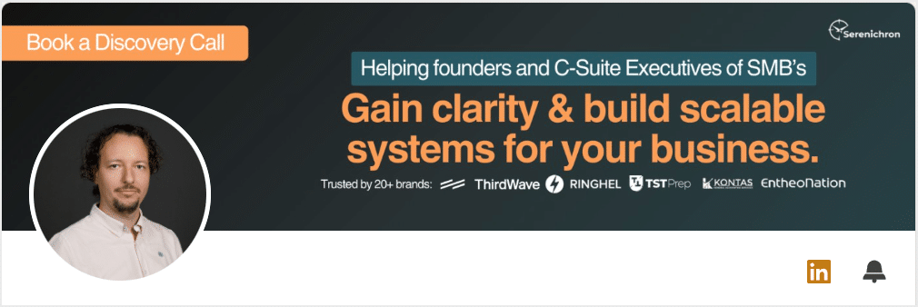
Your visuals speak before your words do. Your profile picture should be a high-quality headshot that aligns with how you show up professionally and be clear, friendly, and up to date.
Your banner? That’s your billboard, and one of the most powerful visual assets on your profile.
Tips:
- Use a high-quality headshot that aligns with how you show up professionally.
- Use the banner space to clearly state your value proposition. This is the first moment where strong messaging really counts. Sum up the core value you offer in just a few words. Add social proof like “As seen in Forbes / Business Insider,” client metrics, or a short testimonial. Keep design clean and sized correctly (1584×396 for banner, 400×400 for profile photo).
- Include your brand logo for visibility and client logos to build authority and trust.
- Design your banner with consistent brand fonts and colours so it complements the rest of your visual identity.
- Keep it clean. Avoid cluttered backgrounds or too much text.
- Keep the content aligned in the right two-thirds of the banner. The left third is risky. On mobile, the profile image overlaps much more than on desktop. You can use the top left corner for a subtle call-to-action, like “Book a discovery call.”
👉 Mobile preview:

Personal information
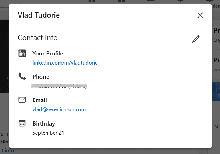
Right below your name, LinkedIn allows you to edit a variety of details via the “Edit intro” pop-up. These might seem minor, but they boost visibility, add credibility, and make it easier for the right people to reach you.
Here’s what you can add or update:
- First name and last name
- Current position (linked to your Experience section)
- Industry
- Education (optional, but visible here if filled in)
- Location (city and country)
- Contact info, which includes:
- Email address
- Phone number (optional)
- Address (optional)
- Birthday (you can control who can see this)
Tips:
- Use your city and country – especially useful for local networking.
- Add your business email or website for direct access.
- Consider adding your phone number if you’re comfortable with inbound contact.
Headline and custom buttons
This part of the profile has more functionality than meets the eye. It’s where you can guide visitors with links, buttons, and a short but impactful headline. Let’s break it down:
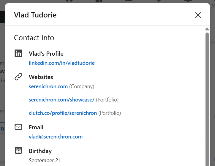
Websites (in Contact info): LinkedIn allows you to add multiple websites under your contact info. This is a great opportunity to direct visitors to key destinations beyond just your main homepage.
- Navigate to: Edit intro → Edit contact info → Websites
- Add multiple URLs—these will appear in the Contact Info pop-up as plain links
- Use this area for your main website, Linktree, social media, etc.
Even though LinkedIn lets you add multiple websites here, I’ve consistently run into errors when trying to add more than three, so make sure to highlight your most important links first.
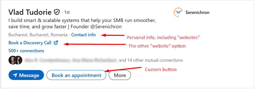
Custom Website with link text: Separate from the Contact Info section, this feature lets you create a clickable link with custom text. It’s subtle but powerful if used right.
- Found in: Edit intro (not Contact Info)
- Lets you create a clickable link with custom text (up to 30 characters)
- Premium feature
- Perfect for CTAs like “Book a Discovery Call” or “Download the Guide”
Premium custom button: If you’re using LinkedIn Premium, you unlock the option to add a custom call-to-action button directly to your profile.
- Available only to Premium users
- Choose a button label from a preset list (e.g., “Schedule an appointment”)
- Add any URL, or use LinkedIn’s built-in scheduling tool (powered by Calendly)
- Great for directing traffic to conversion pages
Headline: This is one of the most important text fields on your profile. It appears right under your name and shows up in search results, comments, and messages.
Use it to clearly state who you help and how you help them. This is not the place to over-explain your job title or pile on self-praise. Instead, think of it as a short, sharp positioning line that signals value to your ideal audience.
It appears right under your name and shows up in search results, comments, and messages.
Tips for a strong headline:
- Max 220 characters (but aim for 120–130)
- Use to state who you help and how you help them
- Avoid repeating banner text; make this complementary
- Make it clear and benefit-driven
- Mention your role and what problem you solve
- Use keywords your audience might search for
- Consider including your brand name
Once you’ve got these details nailed, your top section will clearly communicate who you are, what you do, and how people can take action, without needing to scroll.
Bonus: Instant Messaging options. In the Contact info section, you can also connect your profile to messaging platforms like Skype, Google Hangouts, WeChat, and others. If you use one of these services for business communication, it’s a quick way to make yourself reachable through more than just emails or DMs. It may feel a bit old-school, but it adds another layer of accessibility.
The About section: Tell a clear, human story
Most profiles fall short in the About section, usually a vague paragraph or two that doesn’t really say much. That’s how Vlad’s used to be as well: short, generic, and missing a clear message.
Now, instead of just tossing in a few lines about his role, I treat it like an elevator pitch, crafted with intention, structure, and personality. And once you realise how much room LinkedIn gives you, it becomes clear that this is a huge opportunity to communicate who you are and how you help.
The About description: A story with strategy
The About section gives you up to 2,600 characters to describe yourself, and that’s a lot of space. Most people barely use 500 characters, which means this area is an open opportunity to stand out.
Think of this as your mini-landing page. But don’t oversell. Write with brand messaging in mind. Instead of simply listing credentials, focus on:
- Your value proposition
- Your target audience
- Your services and expertise
- Your brand tone
- The pain points you solve
Yes, it supports emojis 😊, but don’t overuse them.
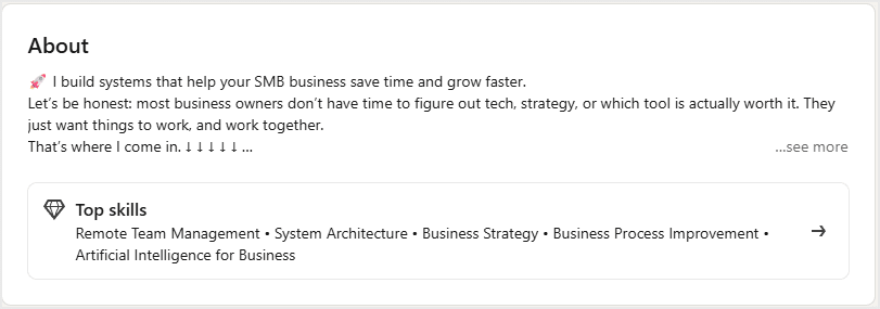
Important: Only the first 3-4 lines are visible on desktop before someone has to click “See more.” That means your intro needs to hook attention fast. This is where brand messaging becomes crucial. Lead with clarity, empathy, and purpose.
About section on page load:
About section expanded:
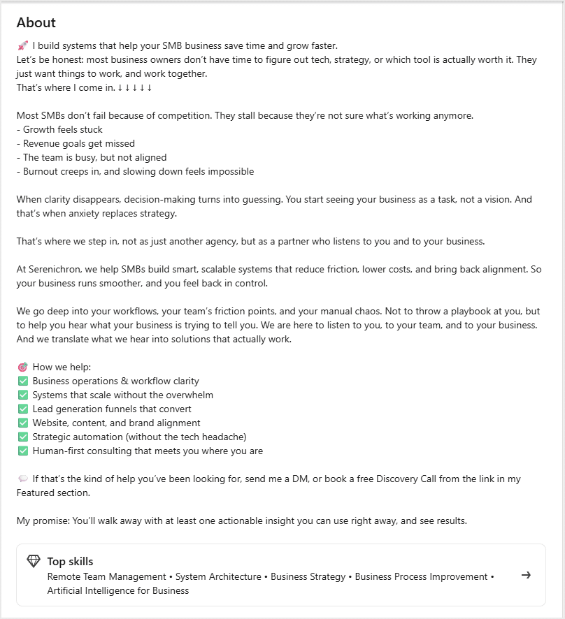
Tips to craft a powerful About section:
- Start with a hook in the first 3 – 4 lines. These are the only ones visible before someone clicks “See more.”
- Make it about your audience, not just your resume. What problems do you solve for them?
- Keep it conversational and human, as if you’re talking to a new connection.
- Tie in your business, your team, your services, and your values.
- End with a simple, clear call to action (like “Let’s talk” or “Check out my latest project”).
Skills section: Just five, so make them count
You can select up to 5 skills to appear on your profile. That’s not a lot, so choose them wisely based on what’s most relevant to your target audience and the services you offer.
These skills help reinforce your positioning and increase profile discoverability.
Services: A focused, flexible showcase
The Services section is a useful feature, one that gives you a dedicated space to highlight what you do, who you help, and how you deliver results. That said, if you ask me, it’s not LinkedIn’s best-designed section. It has quirks, like clunky media handling and limited layout options. Still, when used thoughtfully, it becomes a valuable touchpoint for credibility and conversation.
Here’s what you can do:
- Select up to 10 services from a predefined list. Take your time and choose everything that reflects what you actually offer.
- Add a description (up to 500 characters) where you can restate your value proposition and explain how you deliver it. Only the first 2 lines are visible until viewers click “See more,” so front-load the good stuff.
- Set pricing information if you’d like, though this is totally optional.
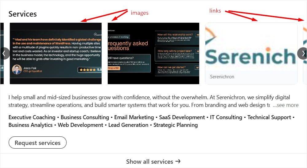
This section also allows you to add up to 8 media items, displayed in a carousel above your service list. These include:
- Images: Great for visual testimonials, FAQs, infographics, and branded service breakdowns. (Note: Images cannot contain clickable links.)
- Videos: These could be demos, case study reels, or anything you think adds value, though LinkedIn doesn’t give much customisation here. (I haven’t explored this enough myself!)
- Links: You can link to any page, such as your website’s services page, scheduling page, lead magnet, or landing page. LinkedIn will automatically pull the page’s featured image. You cannot customise the image preview here, so make sure your web pages have strong thumbnails.
While you can’t associate media with specific services individually, you can still use this “media gallery” to create a strong first impression and reinforce your expertise across the board.
One thing to note: if you’re on a free account, visitors will only see your list of services on the main profile. The description and media show up only when someone clicks into the Services page. Premium users, on the other hand, get the bonus of having everything (services, description, and media) displayed right on the profile.
Pro tip: Keep your visuals on brand. The images you upload here, the banner in your top section, and even the preview thumbnails from your links should follow a consistent design style. Using the same fonts, colours, and visual tone across assets helps create a polished, professional look. Think of it like a mini style guide for your LinkedIn profile, one that builds trust and shows you’re intentional about your brand.
Hidden bonus: Open messaging channel. When your Services section is active, it quietly opens up a way for anyone on LinkedIn to message you, even if they aren’t connected and don’t have InMail. It might not drive tons of leads, but it’s still a low-friction way to stay open for new conversations.
Featured content: Spotlight your most clickable assets
This is one of the most flexible and creative sections of your profile, and a great spot to spotlight key links, posts, and content.
You can:
- Pin posts and articles already published
- Feature your LinkedIn newsletters
- Add media like images, documents, PDFs, or presentations
- Add external links (with a custom image, title, and description!)
That last one is the most visually customizable. Unlike other sections, you can upload your own thumbnail image for each link, and write a short, compelling title and description. This makes the Featured section feel polished, complete, and aligned with your brand.
Use it to showcase:
- Your company presentation
- Your scheduling link
- Case studies or lead magnets
- Special offers or events
- Projects you’re involved in
A few notes to keep in mind:
- You can reorder items, so put your most important links first
- The image appearance and cropping can vary depending on how many items are featured and the length of each description. You’ll need to play around to find the best fit and avoid awkward cuts or framing.
- You can’t change a link URL once posted. If you need to update the URL, you’ll have to create a new item and delete the old one
This is another area where consistent messaging and visuals really matter. Your featured content should echo the same tone, style, and design approach as your banner, services section, and other visuals. That consistency helps your profile look intentional, polished, and professional.
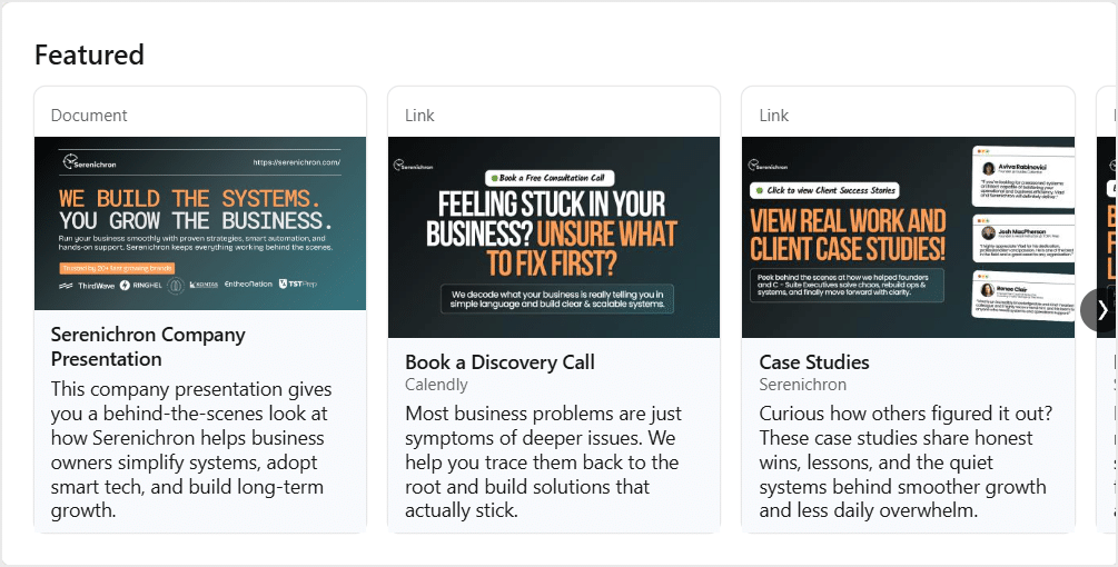
Tips:
- Start with 3-4 featured items that create a clear, high-level overview of what you do.
- Use custom-designed images with intentional text overlays (e.g., “Case Study,” “Free Guide,” “Book a Call”).
- Write short, benefit-driven titles and descriptions that invite clicks.
- Refresh this section regularly to keep it aligned with your current focus or campaigns.
- Use visual hierarchy: your most important content first, followed by supporting pieces.
Experience reimagined: Go beyond your CV to tell your brand story
Here is where you add your past and present roles, complete with company name, position title, start and end dates, and location. On the surface, it’s the most CV-like part of the profile. But if you’re a founder, entrepreneur, or consultant, this is more than a timeline; it’s another space to strengthen your brand message.
Here are two underrated opportunities this section offers:
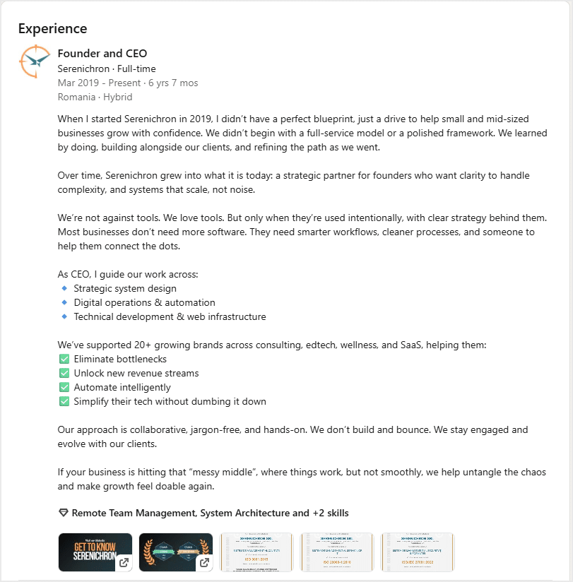
1. Up to 2,000 characters per role. Most people drop in a few lines or skip the description entirely. But you can write a mini sales page here, especially for your current role. Go beyond what you do and talk about what your company does, for whom, and why. Think of it as another chance to speak to your audience using brand messaging.
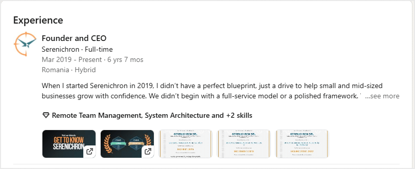
Just like other description areas, only the first two lines are visible on page load. The rest is hidden until the viewer clicks “See more,” so make those opening lines count.
Job experience section on page load:
Job experience section expanded:
2. Media and links. Each position lets you upload media or add links. You can:
- Upload images, documents, or presentations (like certifications or brochures).
- Add links to your website, lead magnets, landing pages, or case studies. You can customise each link’s title, description, and featured image.
Design tip: Link preview images in this section are smaller than in the Featured section. Make sure your visuals are legible even at a reduced size.
Final thoughts: Sharpening your profile, step by step
Optimising your LinkedIn profile doesn’t have to be overwhelming, and you don’t need to do it all at once. A few smart updates in the right places can lead to more visibility, stronger connections, and better opportunities.
This revamp helped me understand just how many tools LinkedIn offers, and how much more effective a profile can be when you combine good messaging with strong visuals.
A big thank you to Tripti Agarwalla for her help with both the visual assets and the messaging strategy, and her focus on social media presentation.
Social media is just one piece of the puzzle. At Serenichron, we focus on the full picture: your website, funnels, messaging, and operational assets. If you want your digital presence to work like a well-oiled machine, we can help you build the systems that connect and convert.
👉 Reach out and let’s elevate your digital presence together.
About the Author

Alex writes about systems, strategy, and the underrated power of doing things the smart way, not just the fast way. As Serenichron’s system architect, he blends tech, operations, and business development into real-world solutions for entrepreneurs who want to scale with sanity.
About Serenichron

Helping businesses grow by simplifying strategy, streamlining systems, and making tech actually work for people. We bring clarity to chaos with practical tools, honest guidance, and just enough curiosity to question the default way of doing things.